How to Write Effective Software User Guides
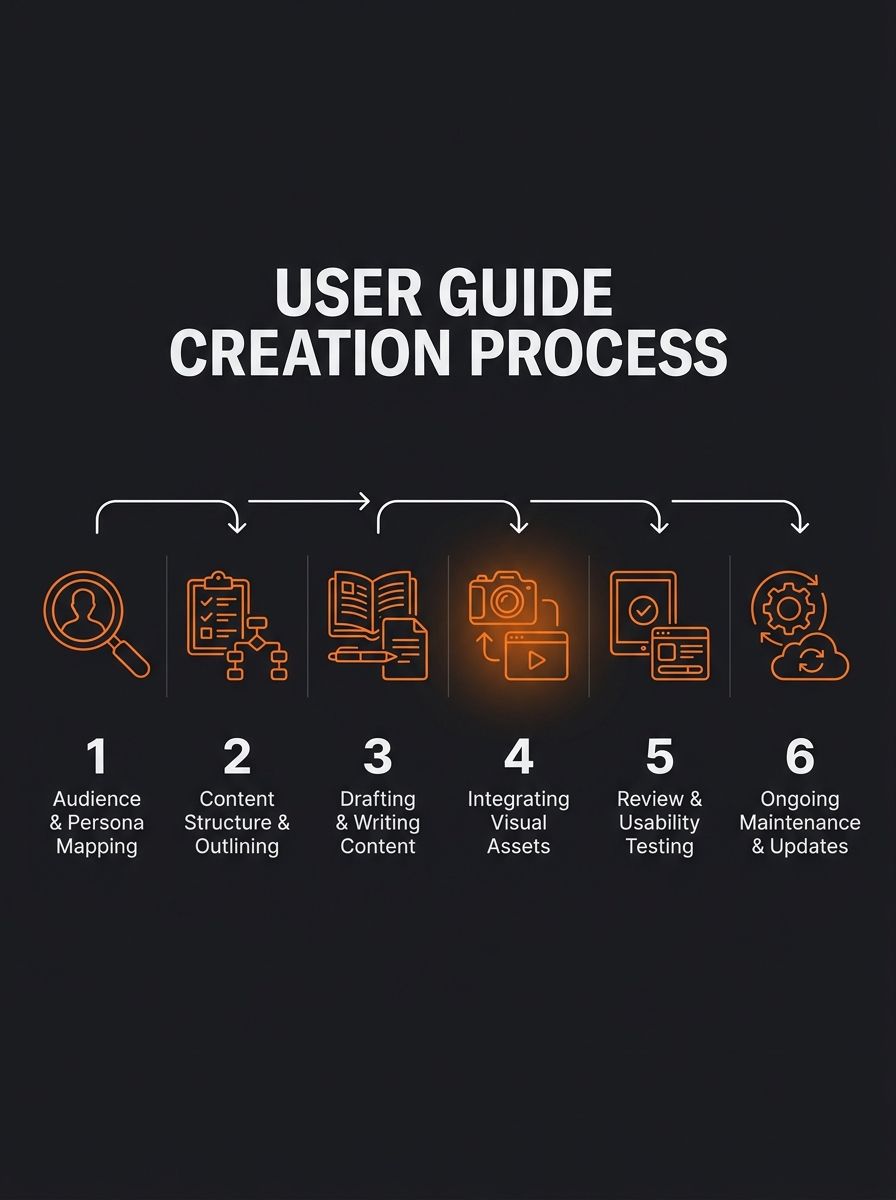
Writing effective software user guides requires six sequential steps: audience mapping, task-based outlining, plain-language drafting, visual annotation, live usability testing, and release-synced maintenance.
How to Write Effective Software User Guides That People Actually Read
Writing effective software user guides requires six sequential steps: audience mapping, task-based outlining, plain-language drafting, visual annotation, live usability testing, and release-synced maintenance. Each guide takes 2–4 hours from blank page to published doc, and you'll slash support ticket volume in the process.
Before You Start
You need four things in place before Step 1:
A working version of the software you're documenting. Not a prototype, not a wireframe. You need to click through every workflow you plan to cover.
Access to your support ticket history. Pull the last 90 days of tickets and tag the top 10 recurring questions. These become your priority sections. If 80% of your tickets cluster around 20% of features, that 20% gets documented first.
A screenshot tool with annotation features. Snagit, CleanShot X, or even macOS's built-in Screenshot utility with Markup will work. Minimum requirement: arrows, numbered callouts, and highlight boxes.
A documentation platform or template. Google Docs works for version 1. GitBook, Notion, or Confluence work better at scale. If you want a head start on structure, we've published a user guides template for documentation that covers the baseline layout.
Time commitment: 2–4 hours for a guide covering 5–8 core tasks. Longer products with 15+ workflows will take 6–10 hours spread across multiple sessions.
Step 1: Map Your Audience to the Tasks They Actually Perform
The goal: identify who reads your guide and what they need to accomplish, so you don't write 4,000 words about features nobody uses.
Pull your support tickets and categorize them by user type. For a SaaS tool, you'll typically find 2–4 distinct user segments: administrators configuring the system, daily operators running workflows, and occasional users checking reports or dashboards. Each group needs different sections.
Build a simple table:
User Segment | Top 3 Tasks | Knowledge Level | Priority |
|---|---|---|---|
Admin | Account setup, user permissions, billing | Technical | High |
Daily Operator | Core workflow, data entry, exports | Moderate | High |
Occasional User | Report viewing, dashboard filters | Low | Medium |
Map each segment's top 3 tasks by frequency from your ticket data. TechSmith's documentation guide puts it directly: "Assume that the reader knows nothing about your product. Write as if you are communicating with a layman." That's your baseline. Even technical admins skim documentation looking for the one setting they haven't touched before.
You'll know this step worked when you have a completed table with 6–12 specific tasks ranked by support ticket frequency and user segment.
Step 2: Build the Skeleton Before Writing a Single Sentence
The goal: create a table of contents that mirrors your users' task flow, organized by what they do (not by where features sit in your UI).
The biggest mistake in software user guides is organizing content by menu structure. Users don't think in terms of "Settings > Integrations > API Keys." They think: "How do I connect my Shopify store?" Structure your outline around that second framing.
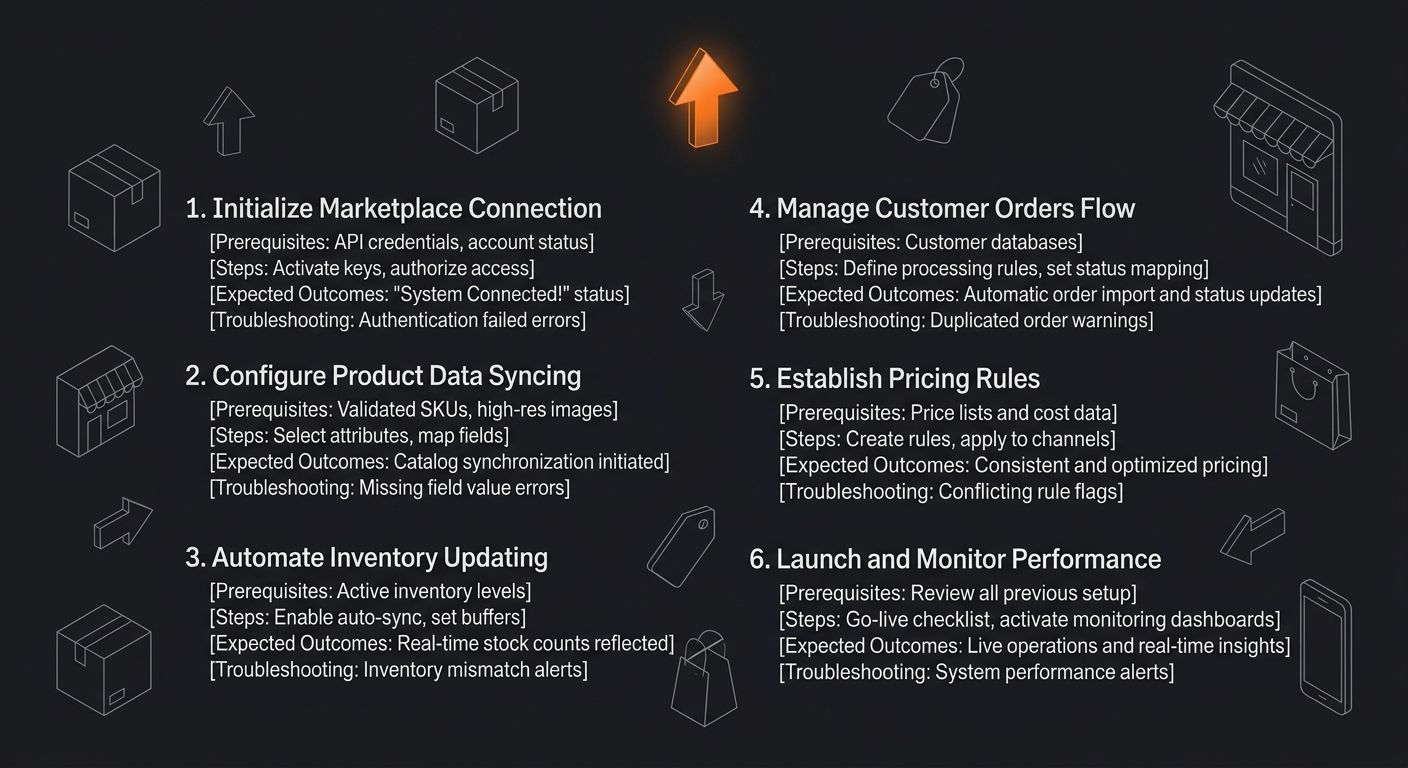
Each section in your outline follows this pattern:
Task title (verb phrase: "Connect Your Shopify Store," "Export Monthly Sales Data")
Prerequisites for this specific task (what needs to be true before the user starts)
Numbered steps (the actual procedure)
Expected outcome (what the screen looks like when they're done)
Troubleshooting (the 1–2 things that commonly go wrong)
This five-part pattern per section is worth committing to memory. Whatfix's research on user guides confirms that "clear copy and short sentences without technical or industry jargon increase readability and comprehension, helping users solve problems faster." Structure does half the readability work before you type a single instruction.
You'll know this step worked when your outline has 5–8 task-based sections, each with the five sub-components listed above, and zero sections named after UI menu items.
Step 3: Write Each Section as a Standalone Answer
The goal: draft every section so a user who lands on it from search or from a support link gets a complete answer without reading anything else.
Here's where most software user guides fall apart. Writers assume sequential reading. Real users don't read sequentially. According to data cited by MadCap Software, user documentation needs to function as standalone reference material, with each section self-contained enough to resolve a query independently. 60% of customers will abandon a product they find difficult to use, so every extra click between a user's question and your answer is a churn risk.
Write each step as one verb-phrase action. Limit sentences to 15–20 words. Target a 6th-to-8th-grade reading level using the Flesch-Kincaid scale (Hemingway Editor gives you this score for free).
Bad step: "Navigate to the appropriate configuration panel and ensure the relevant parameters are properly adjusted."
Good step: "Click Settings > Notifications. Toggle Email Alerts to On. Click Save."
Three rules for the drafting phase:
One action per numbered step. If a step contains the word "and," split it into two steps.
Name every UI element exactly as it appears on screen. Bold the element name. If the button says "Save Changes," don't write "save your work."
End each section with a verification sentence. "You'll see a green confirmation banner at the top of the screen" gives the user a concrete signal that they succeeded. This approach mirrors how we think about building quality matrices for evaluating suppliers: define the pass/fail criteria before you run the process.
You'll know this step worked when every section passes three tests: a user can land on it cold and follow the steps, every UI element name matches the actual interface, and each section ends with a verification sentence.
Step 4: Add Screenshots and Annotated Visuals
The goal: place 1–3 annotated screenshots per task section so users can visually confirm they're in the right place at each critical step.
Screenshots serve a specific function in user guides software teams produce: they reduce ambiguity about which button, menu, or screen the text refers to. Atlassian's documentation team found that visual documentation paired with step-by-step instructions dramatically improves comprehension across user skill levels.
Rules for screenshots:
Capture only the relevant portion of the screen. Full-desktop screenshots bury the important element in visual noise. Crop to the panel or dialog box the user needs.
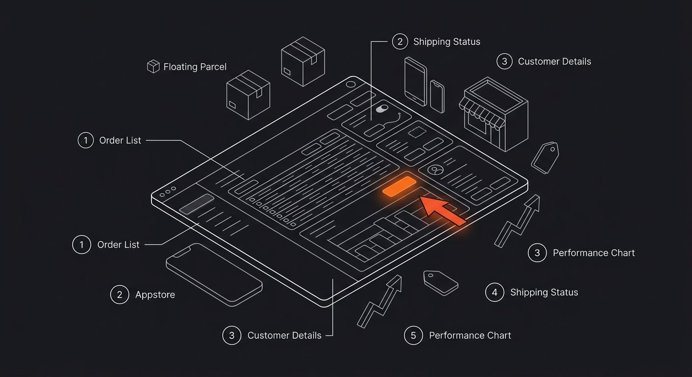
Add numbered callouts that match your step numbers. If Step 3 says "Click Save," the screenshot should have a circled "3" pointing to the Save button.
Update screenshots with every UI change. Outdated screenshots are worse than no screenshots because they actively mislead users. Tie screenshot updates to your release cycle (covered in Step 6).
For video-heavy products, consider embedding 30–60 second screen recordings for complex multi-step workflows. Keep these under 90 seconds. Anything longer and completion rates drop below 40%.
You'll know this step worked when each task section has 1–3 cropped, annotated screenshots with callout numbers matching the written steps.
Step 5: Run a Live Usability Test With 3–5 Users
The goal: watch real users attempt each task using only your guide, and identify where they get stuck, confused, or skip steps.
This is the step everyone skips, and it's the step that determines whether your guide actually works. Research from ProProfs emphasizes that you should "test instructions with L&D partners and real users to close skill gaps fast."
Recruit 3–5 users who match your target segments from Step 1. Give them the guide and a list of tasks to complete. Sit next to them (or share a screen over Zoom) and observe. Do not help them. Track three things:
Metric | What to Record | Red Flag Threshold |
|---|---|---|
Task completion rate | % of users who finish each task without help | Below 80% |
Time-to-completion | Minutes per task vs. your expected time | 2x or more over estimate |
Error count | Wrong clicks, backtracking, re-reads | 3+ per task section |
Any section where fewer than 4 out of 5 users complete the task unassisted needs a rewrite. Common fixes: adding a missing prerequisite, splitting a compound step into two steps, or adding a screenshot at the exact point users hesitated.
This testing process is similar to the audit approach we use for evaluating supplier performance before committing to volume. You define pass/fail thresholds up front, run the test, and fix what fails. No gut feelings, no assumptions.
You'll know this step worked when every task section achieves an 80%+ unassisted completion rate across your test group, and you've revised the sections that fell below that bar.
Step 6: Tie Documentation Updates to Your Release Cycle
The goal: prevent your guide from going stale by syncing documentation reviews to every product release.
ProProfs' documentation best practices state directly: "Regularly review and update your documentation to ensure it stays relevant to the latest version of your product." The cadence matters. Here's what works:
Every feature release: Update affected task sections within 48 hours of deployment. Add new sections for new features. Remove sections for deprecated features.
Quarterly full audit: Read every section end-to-end. Check that screenshots match the current UI. Verify all links. This takes 1–2 hours per guide for a product with 8–12 documented tasks.
Monthly analytics check: Track which guide sections get the most pageviews and which have the highest bounce rates. High-traffic, high-bounce sections are failing users. The same metrics-first thinking that applies to managing suppliers applies here: measure case deflection rate (support tickets avoided) and time-to-proficiency (how fast new users reach their first successful task completion).
Set calendar reminders for the quarterly audit. If you use a docs platform like GitBook or Confluence, configure page-level "last reviewed" dates so stale content surfaces automatically. Teams tracking these metrics see measurable drops in support volume within 90 days of implementing a structured review cadence.
You'll know this step worked when you have recurring calendar events for quarterly audits, a documented process for release-day documentation updates, and analytics tracking on every guide section.
When Things Go Wrong
Three problems show up repeatedly in software user guides:
Problem 1: Users report that steps "don't work" even though they're accurate. The root cause is almost always a missing prerequisite or an assumed state. Check whether your guide specifies what the user's screen should look like before they start the task, and whether you've listed required permissions or account tiers.
Problem 2: Screenshots are out of date within weeks of publishing. This happens when documentation updates aren't tied to the release cycle. The fix is process, not effort: add "update affected docs" as a required line item in your deployment checklist. If you're using automation tools in your operations, set up a notification trigger whenever a UI-related pull request ships.
Problem 3: The guide covers everything, but users still file support tickets about basic tasks. This usually means the guide's information architecture doesn't match how users search. Audit your section titles. If they're feature-based ("API Configuration") instead of task-based ("Connect Your Store"), users can't find the answers through search. Rename sections to match the phrases users actually type into your help search bar or support form.
Where to Go From Here
Once your first guide is live and tested, the returns compound. Each documented task that deflects even 5 support tickets per month gives you hours of reclaimed team capacity. The framework described here scales to multiple guides, multiple products, and growing user bases without structural changes.
Your next move depends on where you are. If you've never written a user guide before, grab the documentation template we published and fill in the skeleton from Step 2. If you already have existing docs that feel scattered, run the Step 5 usability test on your three highest-traffic sections and fix what breaks. And if your docs are solid but your broader operational processes need the same rigor, the same test-measure-fix loop applies to everything from supplier vetting to margin analysis. The documentation habit, once you build it, transfers everywhere.

Ryan Torres
Ryan Torres is a former Amazon FBA seller turned dropshipping consultant who has generated over $2.8M in ecommerce revenue across 14 product launches. He specializes in supplier vetting, margin optimization, and scaling DTC operations for sub-$1M brands. Ryan focuses on actionable frameworks that drive measurable results for independent operators.
Frequently Asked Questions
- How long does it take to write a software user guide?
- A user guide covering 5–8 core tasks typically takes 2–4 hours from blank page to published document. Longer products with 15+ workflows will take 6–10 hours spread across multiple sessions.
- What reading level should I use for software documentation?
- Write user guides at a 6th-to-8th-grade reading level using the Flesch-Kincaid scale. Every grade level above 8 correlates with higher bounce rates on help documentation.
- How many users should I test a user guide with before publishing?
- Test your user guide with 3–5 real users who match your target segments. Any section where fewer than 4 out of 5 users complete the task unassisted needs to be rewritten.
- How should I organize user guide sections?
- Structure user guides around the tasks users perform, not by menu structure or UI layout. Each task section should include a task title, prerequisites, numbered steps, expected outcome, and troubleshooting information.
- How many screenshots should I include in a user guide?
- Include 1–3 annotated screenshots per task section. Screenshots should be cropped to show only the relevant portion of the screen with numbered callouts matching the written steps.
- When should I update user guide documentation?
- Update affected task sections within 48 hours of any feature release, conduct a quarterly full audit of every section, and track monthly analytics on which sections get the most pageviews and bounces. Tie all documentation updates to your product release cycle.
- How do I identify which features to prioritize documenting first?
- Pull the last 90 days of support tickets and tag the top 10 recurring questions. If 80% of your tickets cluster around 20% of features, document that 20% first.
- What should I do if users say guide steps don't work?
- The root cause is usually a missing prerequisite or an assumed state. Check whether your guide specifies what the user's screen should look like before they start the task and whether you've listed required permissions or account tiers.
Related Articles

User Guides Template: Create Better Documentation
The six-section user guides template that ships with every major documentation platform organizes information by product structure, not by user problem.

Buyers Guides: Complete Shopping Decision Framework
Buyers guides that actually convert follow a five-step framework: define the purchase context, build a comparison matrix, weight criteria, score options, and validate margins.

Product Research Surveys: Complete Guide
By the end of this guide, you'll know how to build and deploy a product research survey that returns data specific enough to drive SKU-level decisions. The whole process takes about 3-4 hours for your first survey, faster every time after that.
Explore more topics