The Demand Curve Mechanics of Trending Niches: Why Viral Products Have a Different Margin Profile Than Evergreen Categories
Viral products follow a spike-crash demand curve that compresses margins through a predictable four-stage sequence: rising CPMs, supplier price hikes, competitor flooding, and demand collapse.

The Demand Curve Mechanics of Trending Niches: Why Viral Products Have a Different Margin Profile Than Evergreen Categories
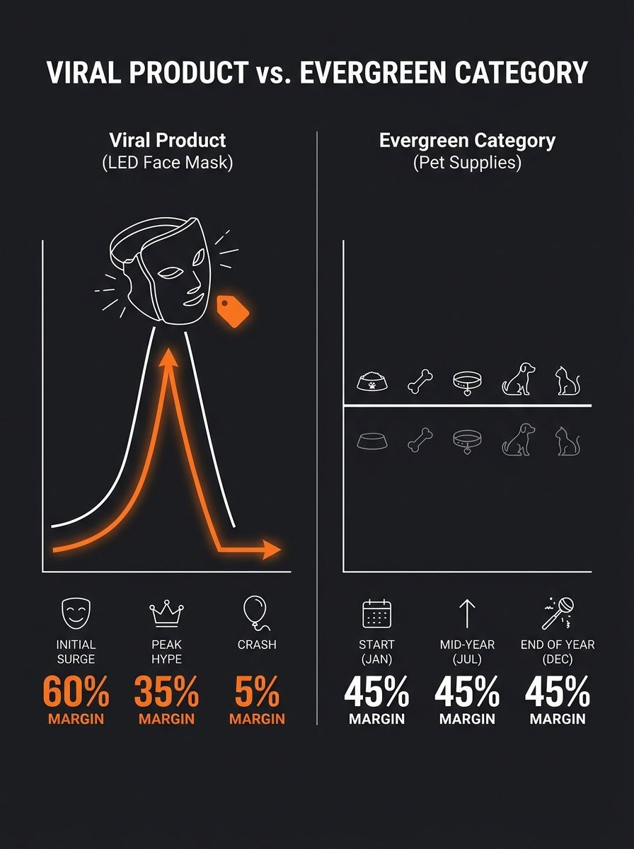
Viral products follow a spike-crash demand curve that compresses margins through a predictable four-stage sequence: rising CPMs, supplier price hikes, competitor flooding, and demand collapse. Evergreen dropshipping categories follow a plateau curve where these same variables stay stable, preserving the niche margin profile across years instead of weeks.
The common assumption is that viral products carry better margins because of higher perceived value and massive volume. As EComposer's 2026 niche analysis puts it, "products that feel fresh or relevant often carry higher perceived value, meaning better profit margins". That's true for roughly the first 3-6 weeks of a viral product's life. After that, every force acting on margin flips direction simultaneously. The demand curve ecom pattern behind this flip is mechanical, repeatable, and visible in the tools most dropshippers already use — if you know what each tool is actually measuring.
Two Demand Curves, Two Margin Architectures
Pull up Google Trends for any viral product from the past 18 months — LED face masks, mushroom coffee kits, portable neck fans. The graph traces a near-vertical ascent over 4-8 weeks, a narrow plateau lasting 2-6 weeks, then a decline that roughly mirrors the rise. Now pull up Google Trends for dog beds, yoga mats, or phone chargers. The line is flat with seasonal bumps, stretching across years.
These two curve shapes produce entirely different margin math. Profitable niches have consistent year-round demand, sustainable margins, and long-term business potential, while trending niches front-load revenue into a narrow window where every cost input is escalating. InsightAgent's 2026 analysis of ecommerce niches found that evergreen categories like pet supplies and wedding products maintain 40-60% gross margins for 12+ months, while viral product categories typically see margins compress from 50-60% down to 15-25% within 90 days of peak search volume.
When you're validating niche demand through Google Trends and Amazon BSR data, you're seeing the demand curve shape. What the graph doesn't show is how four specific cost variables respond to that shape in sequence.
The CPM Ratchet: Ad Costs Track the Curve
The first margin killer hits within 2-3 weeks of a product going viral. Facebook, TikTok, and Google ad platforms run auction-based pricing. When 200 stores start bidding on the same product keywords and interests in the same 14-day window, CPMs rise 30-70% depending on audience size and geographic overlap.
A product you were acquiring customers for at $8 CAC in week one now costs $14-$18 CAC in week four. TikTok Shop, which captures 67% of product discovery traffic, amplifies this effect because its algorithm surfaces the same trending products to the same audiences, concentrating ad competition into narrow demographic bands.
Evergreen categories experience CPM fluctuation too — Q4 holiday spikes push costs up 20-40% across most ad platforms. The difference is predictability. You can budget for seasonal CPM increases because they follow a calendar. You cannot budget for a viral CPM spike because the timing depends on when competitors discover the same product, and spy tools that track competitor activity often accelerate that discovery cycle rather than giving you a durable edge.
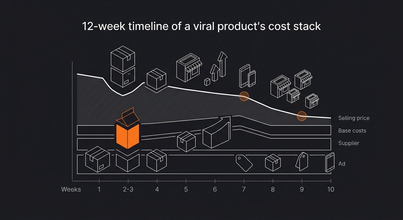
Supplier Repricing Operates on a Lag
The second stage of the viral product lifecycle compression happens on the supply side. Supplier pricing reacts to demand signals, but with a 3-6 week delay. AliExpress and 1688 suppliers monitor order velocity. When a product goes from 50 orders/day to 2,000 orders/day across their buyer base, prices creep up 10-25% — sometimes through direct price increases, sometimes through removed volume discounts or higher shipping tier assignments.
This is textbook margin compression: costs to make or deliver a product rising faster than the sales price. You're simultaneously facing higher ad costs and higher COGS, while competitive pressure keeps your selling price flat or forces it down.
The supplier markup stack makes this worse for dropshippers using aggregator platforms. When factory prices rise 15%, the aggregator's percentage-based fees amplify that increase through each layer — fulfillment surcharges, payment processing cuts, per-order fees — so your effective COGS increase can hit 20-30% even though the factory-level increase was modest.
Evergreen category suppliers rarely reprice on order velocity because the demand baseline is stable. A dog bed supplier selling 200 units/day year-round has no trigger to reprice. That stability is where evergreen dropshipping gets its margin durability.
Competitor Density and the Price Floor
Stage three is the most destructive and the most visible in research tools. When Jungle Scout or Helium 10 shows 400+ Amazon sellers offering the same viral product within 60 days of its trend peak, the price floor drops fast. Sellers undercut each other by $1-$3 at a time, and within weeks the market price settles 30-50% below where early movers launched.
Macroeconomic changes like increased tariffs and e-commerce competition have big effects on margins, with production costs rising and sale prices falling. For viral products, this dual pressure — rising costs and falling prices — happens on a compressed timeline measured in weeks rather than quarters.
Strive Commerce's niche comparison framework confirms that evergreen niches often have less saturation compared to trending markets, which allows sellers to maintain pricing power. A store selling ergonomic desk accessories competes against 30-80 serious sellers. A store selling the viral product of the month competes against 500+, many of whom are willing to sell at breakeven just to generate review volume.
What Niche Research Tools Actually Measure
Here's where the app ecosystem matters. Each tool in the typical niche research stack reveals a different layer of the demand curve mechanism — and has a specific blind spot.
Tool | What It Measures | Blind Spot |
|---|---|---|
Google Trends | Search interest velocity and curve shape | No pricing, margin, or competitor data |
Jungle Scout | Amazon sales estimates, competitor count, review velocity | Lags TikTok-driven trends by 4-6 weeks |
Helium 10 | Keyword search volume, trend direction, listing density | No ad cost or CPM data |
ShelfTrend | Sell-through rate (when sales outpace new supply) | Limited to Amazon; misses DTC channel dynamics |
Facebook Ad Library | Competitor ad volume and creative density | No conversion or cost data |
Google Trends is the fastest signal for identifying curve shape. A product with a Google Trends graph showing 12+ months of steady interest between 50-100 on the relative scale behaves like an evergreen category. A product that rockets from 10 to 100 in 6 weeks and shows no historical precedent for sustained interest behaves like a viral product with the margin compression trajectory described above.
ShelfTrend adds a valuable layer by tracking sell-through rates — the ratio of units sold to new listings entering the market. When sell-through rates drop below 1.0, supply is outpacing demand, and the competitor flood is already well underway. For evergreen categories, sell-through rates typically stay between 1.5 and 3.0 year-round.
The gap in this tool stack is that none of these platforms combine demand curve shape with ad cost trajectory and supplier pricing data into a single view. You have to manually synthesize signals across 3-4 tools to see the full margin compression sequence — which is why most dropshippers catch the trend after stage one (CPM ratchet) has already started.
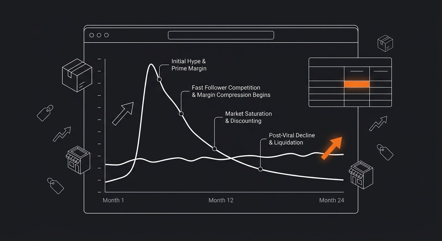
The Four-Stage Compression Framework
Name the stages and you can track them:
CPM Ratchet (weeks 2-4 post-trend): Ad costs rise 30-70% as competitors enter the auction. Your tool signal: Facebook Ad Library shows 50+ active ads for the same product.
Supplier Repricing (weeks 5-8): COGS rise 10-25%. Your tool signal: AliExpress price trackers show unit cost increases; aggregator platform quotes change.
Price Floor Collapse (weeks 6-10): Selling price drops 30-50% as competitors undercut. Your tool signal: Jungle Scout/Helium 10 show price erosion across top listings.
Demand Collapse (weeks 10-16): Search volume and conversion rates decline together. Your tool signal: Google Trends shows a lower demand in the decline phase mirroring the initial rise.
The return rate dimension compounds everything. Products sold during stages 3-4 often come from lower-quality suppliers who entered the market to capture viral demand, pushing return rates from a baseline 5-8% up to 15-25%. Those return rate economics silently destroy whatever margin survived the first three stages.
Evergreen categories don't eliminate these forces. They slow them down to the point where you can adapt. Supplier price changes happen over quarters, competitor entry happens over months, and ad costs follow seasonal patterns you can plan around. The margin architecture holds because the demand curve is flat enough to give you time.
Where The Model Breaks
This framework oversimplifies in two important ways.
First, some viral products transition to evergreen. The classic example from product lifecycle theory: a product that enters through social media virality but solves a genuine recurring problem can stabilize into sustained demand. HBR's foundational product lifecycle analysis, first published in 1965 and still referenced today, describes how products that survive the decline phase of initial adoption sometimes re-enter a second growth phase. Portable blenders followed this pattern — viral in their first cycle, now a stable evergreen category with 40%+ margins for established sellers.
Second, the model assumes you're a price-taker. Stores that build genuine brand equity around a viral product — branded packaging, content-driven customer acquisition, email list ownership — can partially insulate themselves from the competitor flood. Their CAC stays lower because a percentage of traffic comes from owned channels, and their price floor stays higher because customers associate quality with the brand rather than the generic product. But building that brand infrastructure takes 4-8 weeks of focused effort, which is roughly the same window the margin compression cycle takes to complete. The race is tight, and most stores don't start building brand assets until stage 2 or 3, when margins are already contracting.
The practical upshot for tool selection: use Google Trends and ShelfTrend for curve-shape identification before sourcing. Use Facebook Ad Library for stage-one detection. And run the numbers on trending niche margins weekly rather than monthly, because the compression timeline is weeks, not quarters. Evergreen dropshipping rewards patience and operational discipline. Viral products reward speed and exit timing — and the tools that matter most are the ones that tell you when to stop, not when to start.
365 Dropship Editorial
Editorial team writing about E-commerce, dropshipping, and product discovery — reviews of dropshipping suppliers and platforms, trending niche guides (jewelry, beauty, pets, home, fashion), supplier due diligence, ecom operations, shipping & fulfillment strategy, product research, AOV optimization, and profitable dropshipping case studies.
Related Articles

When Spy Tools Become a Liability: How Competitive Intelligence Blinds You to Sustainable Niche Selection
Spy tools trained you to pick niches your competitors already validated, which means every product you launch enters a market where margins are compressing in real time.

How to Build a Niche Demand Validation Stack Using Google Trends, Reddit, and Amazon BSR Before You Source a Single Product
Novadata's 2026 Amazon BSR guide identifies subcategory rank, not main-category rank, as the actionable metric for niche competitive analysis.

Niche-First Dropshipping vs. Product-First: Why 2026's Winners Are Building Around Community, Not Viral Items
Three stores selling the same viral silicone ice tray, sourced from CJ Dropshipping at $4.20 per unit, can run identical Meta ads to the same broad audience and all three will lose money.
Explore more topics